Android Large Screen Optimization
Large Screen Devices - The New Frontier
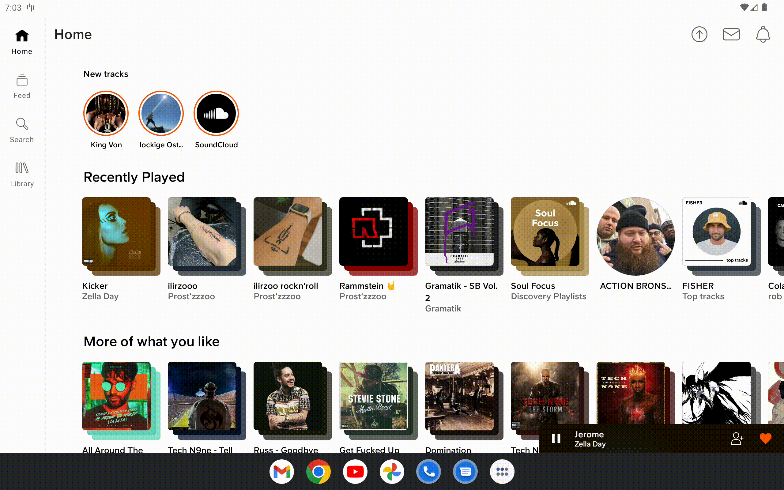
Recently, the Android team at SoundCloud took on a project to optimize the Android app for large screen devices. With the increasing use of devices like tablets, foldables, and Chromebooks, we decided to provide better support for them.
The data showed us users were adopting these devices rapidly. What is more, both Google and Samsung had been vocal about the importance of optimizing for larger screens.
Google is even launching a new Playstore for large screen optimized apps only.
In this blog post, we’ll go through some of the challenges we faced, the UX and UI changes we made, and the code implementation. We hope our experiences will help you in your own large-screen adventures.
Why did we invest in Large Screens?
We saw a trend among our users - more and more of them were using SoundCloud on their tablets, foldable devices, and Chromebooks. And it wasn’t just happening in our user base. Google and Samsung have been going all-in on large screens, bringing them more into the mainstream.
When Google rolled out their Pixel Tablet, well-known tech reviewer Marques Brownlee pointed out that SoundCloud stood out from the crowd. He appreciated that we didn’t just stretch our phone app to fit the larger screen, but instead, we crafted an experience that fully utilized the extra space. If you’re interested, you can check out the video here.
Our Investigation
Where and how is music on large screens heard?
Fun fact: People listen to music on their Tablets mostly while cooking.
Imagine you’re in the middle of preparing a meal, your hands are busy, but you can still easily control your music - that’s convenience at its best.
But it’s not just about individual experiences. Tablets come into play during social events as well. The larger screen makes it simpler for everyone to engage with the music, whether it’s to see what’s currently playing or to add their favorite track to the queue.
Through understanding these usage scenarios, we can better tailor our services to enhance the music listening experiences of our users. Be it cooking dinner or hosting a gathering, SoundCloud is there to make those moments even better with great music.
Google’s and Samsung’s Large Screens Guide
Google’s and Samsung’s large screen guides are roadmaps for developers wanting to optimize their apps for large screens. It encourages using scalable images and responsive and dynamic layouts for a consistent user experience across different screen sizes.
Google also highlights using the extra space for features like split-screen views, and emphasizes touch target sizing, clear text, and intuitive navigation. Following these best practices ensures apps are user-friendly and competitive in the large screen devices market.
Google’s Large Screen Compatibility Checklist
Google’s Large Screen Checklist, available in their Android developer documentation, provides developers with a tier-based framework for ensuring high-quality app experiences on large screen devices. The checklist encompasses not only UI design but also considerations for navigation, keyboard/stylus input, and overall app usage.
The checklist is divided into tiers, offering developers a structured approach to prioritize and implement essential features and optimizations based on the level of support desired for large screen devices. The tiers range from basic support to more advanced features and functionalities that fully leverage the potential of large screens.
The SoundCloud App
When we reviewed Google’s checklist it was clear that the SoundCloud app fell short in certain areas, particularly in terms of adapting the screen layout. The app’s tendency to merely stretch the phone layout to fit larger screens resulted in a less than optimal user interface. This realization was our call to action.
In the upcoming sections, we’ll take you on a visual tour of these components, accompanied by code snippets and technical explanations to provide you with an inside look at our optimization process.
Bottom Navigation Bar
Before: ❌ Horizontally stretched phone layout bottom navigation bar

Traditionally, SoundCloud’s Android app utilized a bottom navigation bar in a phone layout, which was stretched horizontally to fit larger screen sizes. This approach was straightforward, but it proved ineffective for larger screens. The extended navigation bar made it difficult for users to navigate the app, as it required them to move their focus from one end of the screen to the other.
After: ✅ Nav bar rail optimized for large screens

To remedy this, we adopted a vertical navigation rail for large screen layouts, aligning it to the side of the screen. This is recommended by Google as it provides a more comfortable browsing experience. The menu options are now neatly stacked in a column, making them accessible without the need for extensive eye or cursor movement.
Code Implementation
Before: BottomNavigationView
Previously, the SoundCloud Android app used a BottomNavigationView to create the bottom navigation bar. This worked well on smaller devices but led to a stretched UI on larger screens.
After: NavigationRailView
To address this, we replaced the BottomNavigationView with NavigationRailView for larger screens. Both these classes implement the NavigationBarView interface. This allows for a smooth transition with minimal code changes.
To differentiate between smaller and larger screens, we created two separate layout files. One uses the BottomNavigationView, and the other uses the NavigationRailView. In Kotlin, we dynamically set the layout file based on the size of the device.
Identifying Large Devices
We identify whether a device is large or small by using a boolean variable, is_tablet, defined in three separate XML value files based on the screen width.
// res/values-sw600dp/booleans.xml
<bool name="is_tablet">true</bool>

// res/values-sw370dp/booleans.xml
<bool name="is_tablet">false</bool>

// res/values/booleans.xml
<bool name="is_tablet">false</bool>
In Kotlin, we check the is_tablet boolean value and set the layout file accordingly. This is done using the following code:
val isTablet = context.resources.getBoolean(R.bool.is_tablet)

if(isTablet) {
    setContentView(R.layout.tablet_layout)
} else {
    setContentView(R.layout.phone_layout)
}
Hardcoding resources is not the best solution. Google’s documentation provides some great insights on supporting different screen sizes, including the concept of Window Size Classes. Window Sizes allow the UI to adapt to various window configurations on foldable and large screen devices. Here’s the link for more details: Window Size Classes.
Unit Testing and A/B Testing
To enable testing, we added a wrapper class around the isTablet boolean. We also leveraged feature flags to conduct A/B testing of our new layout. We introduced a class NavRailExperiment to check both the device type and the feature flag state:
Here’s a look at our implementation of this approach:
class NavRailExperiment(private val appFeatures: AppFeatures) {
    val isEnabled: Boolean
        get() = context.resources.getBoolean(R.bool.is_tablet) && appFeatures.isNavRailEnabled()
}
Mini Player
Transitioning from a Stretched Phone Layout Mini Player to a Right-Aligned Mini Player
Before: ❌ Horizontally stretched phone layout Mini Player

In the past, SoundCloud’s Android app featured a Mini Player stretched horizontally across the screen. While this design worked for smaller screens, it resulted in a suboptimal user experience on larger devices due to the extended reach required to interact with it.
After: ✅ Small right-aligned Mini Player optimized for large screens

To provide a more user-friendly interface we opted for a small Mini Player on the right side of the screen. This ensures controls are comfortably within thumb reach.
Code Implementation
The Player is a BottomSheet with a ViewPager, the Mini Player is a view inside each page of the ViewPager. We use a BottomSheetBehavior to support collapsed and expanded states. In the expanded state the player shows the full width and height of the ViewPager.
In collapsed state it shows only the Mini Player view, and the height is collapsed to 50dp. The width was always match_parent, but since we want it to be small, we set the width of the BottomSheet to 200dp.
The class BottomSheetBehavior provides us with a method setMaxWidth which we use to set the width while animating the collapse and expansion of the BottomSheet Player.
The other issue here is that we also have to set the width on the ViewPager and the ViewPager’s visible page.
Additionally, we must move the player to the right side thus setting the left margin on layout params on each player transition.
TheBottomSheetBehavior also has a BottomSheetBehavior.BottomSheetCallback field.
The BottomSheetBehavior.BottomSheetCallback has an onSlide method which allows us to set the width and left margin on the BottomSheet and the ViewPager’s visible page.
Below is the code:
bottomSheetBehavior.bottomSheetCallback = BottomSheetBehavior.BottomSheetCallback() {
    val miniplayerWidth = screenWidth * offset
    val leftMargin = screenWidth - miniplayerWidth

    setLeftMargin(viewPager.views(), leftMargin)

    setWidth(viewPager.views(), bottomSheet, miniplayerWidth)
};
Comments & Playqueue on Player
The SoundCloud Android app hosts two main features on its player screen - the comments and the Playqueue. Before, when a user accessed either of these features, a new screen would open, occupying the entire display and obstructing interaction with the player.
Before: ❌ Horizontally stretched phone comments layout

Before: ❌ Horizontally stretched phone playqueue layout

We revamped this experience in the following ways: Instead of taking up the whole screen, the Comments and Playqueue sections now open on the right side of the player. This allows users to engage with these features and interact with the player simultaneously.
Additionally, the buttons to access the comments and Playqueue were originally at the bottom of the screen. To increase accessibility and free up space at the bottom, we moved them to the left side.
After: ✅ Right-aligned comments optimized for large screen

After: ✅ Right-aligned playqueue optimized for large screen

Repositioning the UI elements in this way contributes to a more ergonomic and intuitive user experience on larger screens, reinforcing our commitment to delivering the best listening experience across all devices.
Addressing User Experience (UX) Challenges
Our changes to the UI introduced some UX challenges, especially related to the comments feature. Two major questions emerged:
- When a track changes, should the comments update to correspond to the new track, or should it continue displaying comments from the previous track?
- What should happen to a comment a user is currently writing if the track changes?
To tackle the first issue, we opted to update the comments to align with the new track. We believe this adjustment is more in line with user expectations, as it helps keep the entire screen contextually relevant.
For the second scenario, we implemented a solution where the comments section doesn’t update if the text field is currently in focus. This prevents any in-progress comments being lost, thereby providing a more user-friendly commenting experience.
Code Implementation
To integrate the comments and Playqueue screens over the player, we introduced a new FrameLayout named player_side_fragment_holder. This frame holds the additional features and ensures they are displayed without disrupting the main player.
This side fragment holder is positioned above the player and is assigned a transparent background along with a width of 400dp. Consequently, when the user taps on the comments or Playqueue button, the respective screen appears over the player. This is made possible by a secondary FragmentManager which adds either the CommentsFragment or the PlayqueueFragment to the FrameLayout.
Here’s how the layout is structured:
<FrameLayout
    android:layout_width="match_parent"
    android:layout_height="match_parent">

    <Player
        android:layout_width="match_parent"
        android:layout_height="match_parent" />

    <FrameLayout
        android:id="@+id/player_side_fragment_holder"
        android:layout_width="400dp"
        android:layout_height="match_parent"
        android:layout_gravity="right" />
</FrameLayout>
In this layout configuration, the player_side_fragment_holder is specified to align on the right side, allowing it to overlay the player when comments or the Playqueue are invoked. This approach ensures that the main player remains interactive while users are interacting with these features.
Search
In our drive to optimize the large screen experience, we revamped the search screen to offer both search suggestions and top results side by side. The updated design splits the screen into two sections when users begin a search. One side displays real-time search suggestions, while the other showcases the top results. This allows users to compare suggestions and top results instantly, leading to a more seamless and enriched search experience.
Before: ❌ Horizontally stretched search suggestions

After: ✅ Split search suggestions and search results

Code Implementation
Code Implementation for Split Search Screen
In order to implement our split-screen search feature, we use ConstraintLayout. This offers the ability to create layouts based on percentages, which we use to divide the screen between search suggestions and top results.
To split the screen, we defined a width constraint of 40% for the search suggestions, leaving the remaining 60% for the top results:
app:layout_constraintWidth_default="percent"
app:layout_constraintWidth_percent=".4"
Here is the full code for the side-by-side layout:
<androidx.constraintlayout.widget.ConstraintLayout
    android:layout_width="match_parent"
    android:layout_height="match_parent">

    <FrameLayout
        android:id="@+id/search_container"
        android:layout_width="0dp"
        android:layout_height="match_parent"
        app:layout_constraintWidth_default="percent"
        app:layout_constraintWidth_percent=".4"
        app:layout_constraintBottom_toBottomOf="parent"
        app:layout_constraintStart_toStartOf="parent"
        app:layout_constraintTop_toTopOf="parent">

        <androidx.fragment.app.FragmentContainerView
            android:id="@+id/search_suggestions"
            android:layout_width="match_parent"
            android:layout_height="match_parent" />
    </FrameLayout>

    <androidx.recyclerview.widget.RecyclerView
        android:id="@+id/section_results_top_items"
        android:layout_width="0dp"
        android:layout_height="wrap_content"
        app:layout_constraintBottom_toBottomOf="parent"
        app:layout_constraintEnd_toEndOf="parent"
        app:layout_constraintStart_toEndOf="@id/search_container"
        app:layout_constraintTop_toTopOf="parent" />
</androidx.constraintlayout.widget.ConstraintLayout>
This layout allocates 40% of the screen width to a FrameLayout which houses the search suggestions, while the remaining space is assigned to a RecyclerView for displaying top results. The constraints ensure the proper positioning and responsiveness of these elements, providing a dynamic, user-friendly search interface.
Artist
Our previous design for the Artist screen wasn’t well-optimized for larger screens. The result was a horizontally stretched layout with excessive padding and white space around the artist details. As a consequence, users had to scroll vertically to access tracks or albums from the artist.
Before: ❌ Stretched artist profile


To improve this, we took advantage of the space available on larger screens. We moved the Artist details to the left side of the screen and displayed them more compactly. This makes all the necessary information immediately visible and reduces unnecessary scrolling.
Simultaneously, the right side of the screen is dedicated to displaying the artist’s tracks and albums. This clear separation of content means that users can quickly view and interact with the artist’s music. Through this design, we’ve been able to optimize space and present a well-structured layout that enhances the navigation and interaction for our users on large screen devices.
After: ✅ Compact artist profile

Keyboard Tab Navigation
We needed to support keyboard tab navigation for devices that have keyboards attached. You can easily test your apps by connecting a bluetooth keyboard.
If you are using AppBarLayout you might end up not navigating through the toolbar icons.
We had to set touchscreenBlocksFocus = false to our AppBarLayout in order to allow navigating through the toolbar icons.
At first, we had problems navigating the player using a keyboard. The default navigation did not work correctly so we had to force set the navigation flow.
To do this we use the xml attribute android:nextFocusForward.
For better understanding, here’s the specified order for tab key navigation in the player:
- First, the focus lands on the artist’s name.
- Then, it moves to the track name.
- Next, it goes to the option to minimize the player.
- After that, it directs to the ‘Follow artist’ option.
- It subsequently moves through options like ‘Like’, ‘Comments’, ‘Share’, ‘Playqueue’, and ‘More’ buttons.
- Lastly, it settles on the ‘Play/Pause’ button.
Space bar toggles playback - Only for media playback apps
One of the requirements from Google is to support playback toggling through the space bar key. This feature allows users to play or pause music just by hitting the space bar on their keyboards, irrespective of their current position in the app.
The implementation of this functionality can be achieved by overriding the onKeyUp method. On detection of a key press, it verifies if the pressed key corresponds to the space bar, and if so it toggles the playback and returns true.
In all the Activity classes where the play/pause button is present, the onKeyUp method is overridden as shown below:
override fun onKeyUp(keyCode: Int, event: KeyEvent): Boolean {
    takeKeyEvents(true)
    return if(keyCode == KeyEvent.KEYCODE_SPACE) {
        true
    } else {
        super.onKeyUp(keyCode, event)
    }
}
It’s worth noting that we used the takeKeyEvents(true) method to ensure that the current activity can handle key events.
Finally, to make sure the play/pause button is the default focus, we set android:focusedByDefault="true" on the button. This is done to prevent other views from gaining focus by default, which could intercept the space bar key press event.
Testing on Emulators and Devices
When it comes to testing on large screens, we found the Desktop emulator to be the most suitable option. The key benefit is its ability to swiftly resize the app window, mirroring the actions performed on a typical device. This allows us to test responsive behavior on different devices like phones, tablets, and desktops.
Google also offers support for emulators designed for foldable devices. These emulators can be useful for preliminary testing. However, we mostly relied on a physical device, the Samsung Fold, to conduct tests for foldable devices, as it proved to be more accurate.
Lastly, to ensure our app supports hover states and keyboard operations efficiently, we used the Samsung S7+ equipped with an S Pen and Keyboard Bundle. This allowed us to simulate an environment similar to a laptop or a tablet with a keyboard.
Conclusion
Our journey to optimizing for large screens was filled with exciting challenges and insightful discoveries. We realized that providing a seamless experience across a variety of devices - from smartphones to tablets, desktops, TVs, foldables and more - was more than just stretching our existing user interface. It was about reimagining and reconfiguring every element and interaction to deliver a superior music streaming experience.
In addressing the various UI and UX challenges, we found that each element of our service had the potential to be adapted and improved. We reworked our Player and Search screen, redesigned the Artist screen layout, and made sure that keyboard navigation and hover states were smoothly implemented. This process of continuous improvement reinforced to us how important it is to stay flexible in the face of evolving trends.
As technology continues to change and expand, we are committed to staying ahead, making sure that SoundCloud remains the leading choice for music streaming, no matter the device.